Now a days it has become very important to make
responsive pages due to a many devices with different screen size available now and more people are using these mobile devices for browsing and reading. Responsive web pages should be designed to render properly on all devices.
In blogger there are many responsive templates which are free and paid available for download. These templates are very helpful for making the your blog responsive.
Still in some templates, the pictures inserted in the posts are not responsive due to the fixed size options provided by
blogger post editor.
In this case you can follow these simple steps to make the picture responsive. This method can also be used if you do not have a responsive template,
but want the picture to be of certain percentage of the page body. For
example you may want the image to fill the page body by width or you may
want the image width to be half the size of the page width.
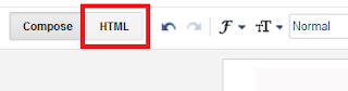
- Switch to HTML view in blogger editor after adding picture
- Find <img followed by link to the image
- Add the code style="width: 100%; height: auto;" after <img with a space separating img and new code.
- Preview and post.
- Do this only before posting. Because, blogger manipulates the html code when you edit again. This may cause problem with appeariance.
- For youtube videos embed the youtube iframe between the following code <style>.embed-container { position: relative; padding-bottom: 56.25%; padding-top: 30px; height: 0; overflow: hidden; max-width: 100%; height: auto; } .embed-container iframe, .embed-container object, .embed-container embed { position: absolute; top: 0; left: 0; width: 100%; height: 100%; }</style><div class='embed-container'> Your YouTube video embed code from share option in YouTube video page </div>
Note:
- If you have installed a responsive blogger template, but blogger default template is loading the you have to follow these steps to disable default blogger template for mobile.
- By changing the value 100% to a lower value in code for image, it is also possible to keep the image always smaller by a percentage of page body.


No comments :
Post a Comment